The Macallan, David Carson and the art of modern luxury
The legend of single malts and the rebel of typography join forces to transform bottles and boxes into collectible design artefacts


AUTUMN HAS ALWAYS BEEN A paradoxical season. It’s the moment when nature exhales in fiery tones, shedding what is no longer needed, while quietly preparing for what comes next. It’s a season of refinement and recalibration, of looking back at what endures, and forward to what must evolve. In this landscape of transition, the world of whisky has found its own moment of transformation.
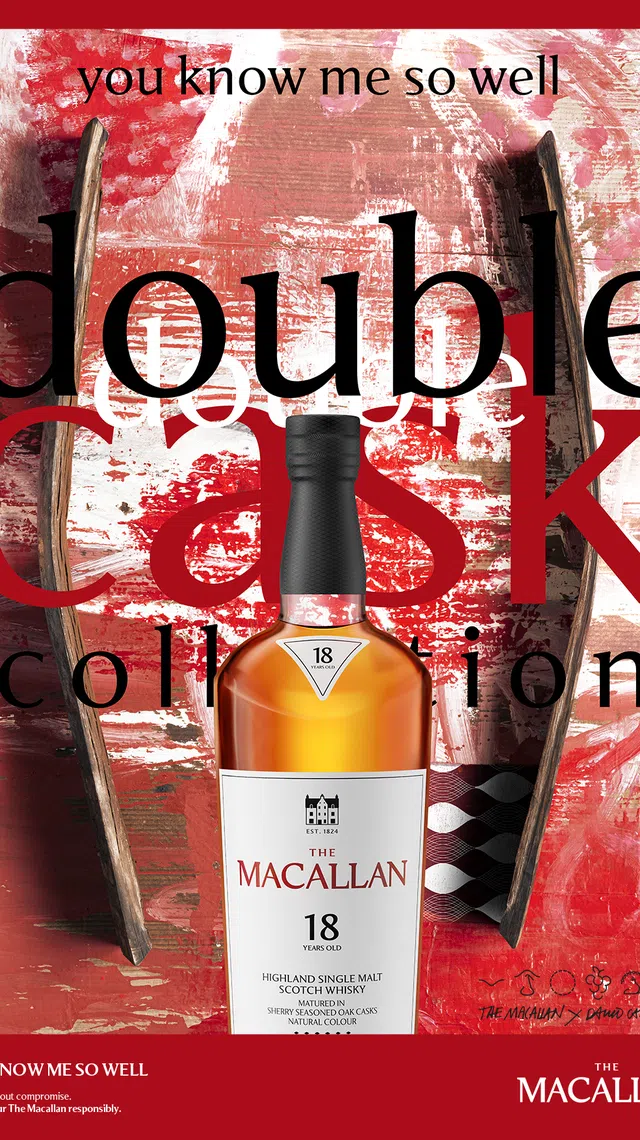
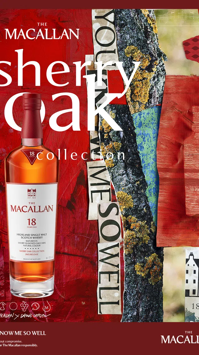
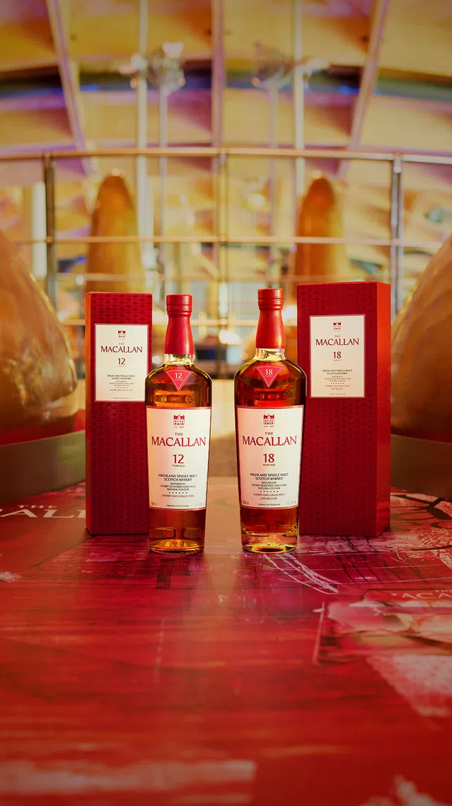
For The Macallan, which has been crafting extraordinary single malts for over two centuries, this autumn ushers in a striking reimagination of its Timeless Collections, comprising the Double Cask and Sherry Oak collections. The whiskies remain unchanged in taste, rooted in the distillery’s peerless craftsmanship.
However, their visual identity has been recast by David Carson, the maverick graphic designer who revolutionised visual culture in the 1990s. The result is more than a design update – it’s a dialogue between heritage and disruption, and a statement about how modern luxury is increasingly expressed through the fusion of art, emotion and individuality.
When rebels meet rituals
Carson is not an obvious partner for a house as storied as The Macallan. His reputation was forged in the pages of Ray Gun magazine (he was art director from 1992 to 1995), where he gleefully shredded design orthodoxy with deconstructed typography and rule-breaking layouts. His work has always been about feeling before function, and letting raw emotion shape visual language.
The Macallan, by contrast, embodies continuity and precision. Each bottle – each expression – is the culmination of decades of craftsmanship, with oak, sherry and spirit guided into harmony through patience and tradition.
On the surface, Carson’s disruptive nature and The Macallan’s refinement might appear at odds with one another. But their collaboration tells a deeper story: Both designer and distiller, are, in their own ways, obsessed with balance. As Carson himself notes: “Like whisky, design is all about balance.”
In pairing his unique vision with The Macallan’s heritage, the collaboration becomes an exploration of how ritual can be disrupted. Not to diminish its meaning, but to expand it. The whisky in the glass remains the same – what changes is the way we encounter it, perceive it, and perhaps even feel it. Feeling before function, as Carson would.
Distilling design
Carson’s work for The Macallan is not surface embellishment; it’s rooted in the elements of the brand itself. The sweeping green roofline of The Macallan Distillery in Speyside finds its echo in the new bottle design, creating a direct architectural connection between the packaging and the land that nurtures the whisky.
The triangular shoulder label draws its geometry from Spain’s Sherry Triangle, the Andalusian region famed for producing the sherry-seasoned oak casks that shape the character of every Macallan dram.


Meanwhile, the rear labels feature a new cask-type symbol, a design motif that animates the interplay of flavour, aroma and wood. Even anti-counterfeit technology – once a purely functional detail – has been introduced into the story, with QR codes offering deeper layers of traceability and discovery.
What Carson has achieved is more than aesthetic. It’s an act of translation, where oak and sherry, architecture and terroir are not just flavours, but forms to be seen.
Two collections, one signature
The redesign encompasses The Macallan’s two iconic ranges, each with its own distinctive character, yet bound by a shared DNA. Carson’s approach allows these differences to resonate visually. Each bottle becomes a design artefact that expresses its personality even before the first sip is taken.
The Double Cask Collection celebrates harmony between American and European oak casks, which are seasoned with sherry wine from Jerez de la Frontera, Spain. The result is a whisky both creamy and spiced, unfolding with fresh fruits and toffee before deepening into baked fruits and warm spices with age.
The Sherry Oak Collection is the embodiment of richness and depth, shaped exclusively by European oak. Its mahogany hues and layered notes of dried fruit, ginger and wood spice reflect the very heart of The Macallan’s heritage.
Heritage need not be static
What makes this collaboration significant is not simply that The Macallan has updated its labels, but what this gesture represents in the larger conversation about luxury.
For much of the 20th century, luxury was defined by permanence, restraint and understatement. Quality, it seemed, needed no reinvention. But in today’s cultural landscape, luxury is expected to be both timeless yet dynamic, rooted in tradition yet conversant with contemporary art, design and emotion.
By inviting Carson into its world, The Macallan signals its understanding of this shift. It’s a move away from the purely ceremonial towards the experiential. The whisky itself remains the ritual object – unchanged, consistent, peerless – but the way it’s framed and encountered is now refracted through the lens of contemporary design.
It’s a luxury dialogue between old and new, control and disruption, craft and creativity. It’s a reminder that heritage need not be static, and that even the most established icons can find renewal by embracing artistic risk. As Jaume Ferras, creative director at The Macallan, affirms: “The Macallan has never stood still and never will.”
Autumn is not about discarding value, but about clarifying essence, stripping away excess so that what matters endures. It’s a season that marries nostalgia with anticipation, reflection with transformation. The Macallan’s new visual identity embodies this same rhythm. While the whisky remains constant, the design evolves into an expression that invites us to see the familiar anew.
This autumn, as the world tips once again into a season of refinement, The Macallan’s Timeless Collections stand as a testament to contemporary luxury: Grounded in heritage, yet unafraid to evolve; timeless in taste, yet newly expressive in form. They are, in their own quiet way, toasts to reinvention – one dram at a time.
The Macallan’s reimagined Timeless Collections will be available in phases in 2025. For more information, visit www.themacallan.com.
Decoding Asia newsletter: your guide to navigating Asia in a new global order. Sign up here to get Decoding Asia newsletter. Delivered to your inbox. Free.
Share with us your feedback on BT's products and services


