

Africa is bigger than you think. But does size matter?
The continent’s physical size is potentially an asset – but poor connectivity can turn size into economic distance
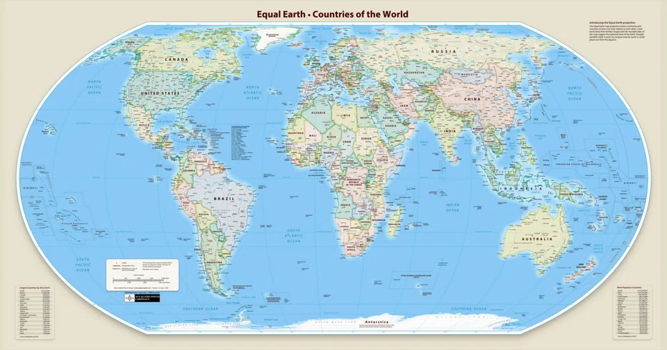
AFTER years of campaigning, African countries led by Togo and backed by the African Union won an unusual victory at the UN recently: the General Assembly overwhelmingly endorsed the use of map projections that show continents in their correct relative proportions.
The resolution passed by 164 votes to one, with only the US voting against and six countries abstaining.
It is non-binding, but it challenges something most of us have taken for granted: our mental picture of the world. And that picture dramatically shrinks the relative size of Africa.
The continent that maps made smaller
Foreign travellers in Africa are often surprised by how long it takes to get from one part of the continent to another.
A hypothetical west-to-east flight from Senegal to Somalia in a modern long-haul jet would take roughly eight to nine hours – around three hours longer than flying from Los Angeles to New York and about the same duration as flying from Singapore to Auckland.
The surprise reflects the map in our heads, not the geography on the ground.
We tend to perceive distances across Africa as much shorter than they really are as the familiar world map drastically understates Africa’s size relative to places farther from the Equator.
On the traditional Mercator map shown in atlases, Africa can appear about the same size as Greenland, the US, Canada or China.
The reality is startlingly different.

At about 30.4 million sq km, Africa is roughly 14 times the size of Greenland, three times the size of Canada, more than three times the size of China or the US, and nearly four times the size of Australia.
Indeed, Africa is large enough to contain the US, China, India and most of Europe combined.
The problem lies in the way the world has conventionally been transferred from a globe onto a flat sheet of paper.
Mercator’s brilliant distortion
Flemish cartographer Gerardus Mercator devised the familiar map in 1569. His objective was not to show the relative sizes of continents but to help sailors navigate.
Mercator’s ingenious solution was to stretch the map progressively as it approached the poles. This was immensely useful to sailors. A navigator could draw a straight line between two points, determine its compass bearing and steer that bearing without continually recalculating direction.
But there was a price.
The farther a place lies from the Equator, the more its area is exaggerated.
Greenland, Canada, Russia and northern Europe consequently balloon in size. Africa, much of which lies close to the Equator, receives little enlargement.
Mercator’s distortion was therefore not a cartographic blunder. It was a deliberate trade-off. He sacrificed accurate area to produce a map exceptionally useful for navigation.
The mistake came later: a navigational map became our default picture of the world.
Putting Africa back in proportion
There are other ways to flatten a globe. The Equal Earth projection, developed by cartographers Tom Patterson, Bernhard Jenny and Bojan Savric in 2018 and not designed for navigation, preserves the relative areas of countries and continents.
Africa suddenly looks enormous. For African governments and activists, this is about more than cartography. They argue that centuries of visually “undersizing” Africa have helped shape perceptions of the continent itself.
“Maps shape our understanding of the world. They guide education, nourish the imagination and influence collective perceptions,” Togo’s Foreign Minister Robert Dussey told the UN before the vote.
“A fair map does not change the geography of the world,” he added. “It changes how we see the world.”
A valid point, but it raises a difficult question: if we see Africa differently, will we also value it differently? Will a bigger-looking Africa attract more attention? Some campaigners think so.
Moky Makura, executive director of Africa No Filter, one of the organisations behind the “Correct the Map” campaign, argues that diminishing Africa geographically has diminished perceptions of its economic, cultural and political importance, and that a truer map can change the narrative.
There is some intuitive logic to this. Seeing Africa at its true scale may sharpen appreciation of the extent of its natural resource endowments: minerals, hydrocarbons, farmland, forests and renewable energy potential.
It may also reinforce perceptions of the market potential of a continent containing around 1.5 billion people.
But here the argument becomes more complicated. Physical size is not economic size. Indeed, the new map may make some of Africa’s disadvantages more apparent, too.
When size becomes distance
Africa’s enormous distances – now better appreciated – call for longer roads and railways than we thought, larger electricity grids and telecommunications networks, and higher costs of moving goods and people.
A huge mineral deposit hundreds of kilometres from a port, without reliable railways, electricity or secure mining rights, may be a less attractive investment proposition than a smaller deposit embedded in efficient infrastructure.
Africa’s difficulties are compounded because its enormous territory is divided among 54 national economies that often lack the physical and economic connections necessary to function as a single continental market.
Only between 15 and 20 per cent of Africa’s trade is with other African countries. The World Bank estimates that around 60 per cent of the continent’s trade costs arise behind countries’ own borders, reflecting customs delays, inefficient logistics, transport restrictions, different standards, barriers to services and weak infrastructure.
So, while Africa’s physical size is potentially an asset, poor connectivity can turn size into economic distance.
The continent containing almost 1.5 billion people does not automatically constitute a market of almost 1.5 billion consumers. If goods, electricity, money, data and people cannot move efficiently across borders, businesses confront dozens of smaller markets separated by high transaction costs.
The new map may make Africa look bigger. The economic challenge is to make those distances matter less.
Geography is not destiny
Research on foreign investment reinforces this point.
Economist Elizabeth Asiedu’s influential study of foreign direct investment in Africa found that natural resources and large markets do help attract investment.
But so do low inflation, good infrastructure, an educated population, openness to investment, political stability, low corruption and a reliable legal system.
Her conclusion cuts to the heart of the size debate: countries that are small or poorly endowed with natural resources can compensate through good institutions and policies. Singapore is an obvious example.
The author James Breiding takes the argument further in his 2019 book Too Small To Fail: Why Some Small Nations Outperform Larger Ones And How They Are Reshaping The World.
He argues that smallness itself can generate economic and institutional advantages if countries respond intelligently to their constraints.
With limited domestic markets, small states have little choice but to stay open, which forces rapid adaptation – a speed advantage rather than a scale advantage – while the absence of abundant natural resources creates strong incentives to invest in people instead.
His examples include Singapore, Switzerland, Denmark, Finland, Ireland, Israel, the Netherlands and Sweden.
The comparison with Africa is revealing. For example, Singapore and Switzerland together occupy less than 0.14 per cent of Africa’s physical area, yet their combined nominal gross domestic product is more than half of that of the entire African continent.
That does not mean small is always beautiful or big is necessarily bad.
It means that while size creates possibilities, policies and institutions determine how many of those possibilities can be realised.
China makes the reverse case. It was always geographically and demographically vast and remained poor in recent centuries.
But its modern economic take-off followed the market-oriented reforms launched from 1978 onwards. Its size became a formidable advantage only because policies unlocked it.
Making a huge continent economically smaller
There are reasons for optimism about Africa. The African Continental Free Trade Area, or AfCFTA, signed by nearly every African country, is potentially the continent’s most important attempt to convert geographical scale into economic scale.
Its ambition goes far beyond cutting tariffs. It seeks to liberalise services, reduce non-tariff barriers, simplify customs procedures and make standards, transport systems and regulations more interoperable so that firms can source, produce and sell across national borders.
The associated Pan-African Payment and Settlement System, developed by Afreximbank in collaboration with the AfCFTA Secretariat and the African Union, is attempting to solve another problem: allowing businesses to make cross-border payments in African currencies without routing transactions through external hard currencies and correspondent banks.
These are long-haul projects, but their potential payoff is huge.
For centuries, Mercator made Africa appear smaller than it is. Equal Earth corrects that illusion. Yet, no cartographer can correct the fragmentation, weak infrastructure and institutional barriers that prevent Africa’s physical scale from becoming economic scale. That work belongs to policymakers, not mapmakers.
The new map makes Africa bigger. Africa’s task is, paradoxically, to make itself economically compact.
It must shrink the time required to cross a border, the cost of moving a container, the distance between producer and consumer, the friction involved in moving money and the regulatory barriers separating one national market from another.
If AfCFTA and the infrastructure around it can do that, Africa will gain something far more consequential than additional space on a map. The world will not merely see a bigger Africa but also a bigger African economy. THE STRAITS TIMES
Decoding Asia newsletter: your guide to navigating Asia in a new global order. Sign up here to get Decoding Asia newsletter. Delivered to your inbox. Free.
Share with us your feedback on BT's products and services
TRENDING NOW

Once staunchly pro-China, Malaysian Chinese businesses are now distancing themselves from Beijing

Looking beyond looming CEO succession, should UOB potentially pursue a transformative merger?

Could stablecoins be the future of money?

Grab CEO’s wife Chloe Tong on life with Anthony Tan and finding her purpose

