

Space reconfiguration: From cluttered to tidy, with plenty of storage thrown in
After a decade, this apartment in the east underwent a massive overhaul to meet the growing needs of its occupants
Corinne Kerk
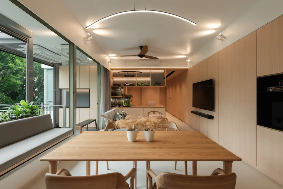
WHEN the Ngs moved into their rented Tanah Merah condominium unit about 10 years ago, the plan was to stay there only temporarily. There was hardly any work done to the home, as it was a fairly new apartment.
“We had a baby and needed a bigger place,” says Mrs Ng. “Over time, we realised we’re quite comfortable staying there and decided to make it our permanent home.”
Upon buying over the unit, the couple, both in the financial services industry, embarked on a long-overdue, massive makeover of the 1,500 square foot apartment. They now have a daughter, 13 and a son, 10.
Their priority?
Increase storage space and create a minimalist, Japanese-style aesthetic.
Major changes in store
The responsibility fell to Zeeson Teoh of Red Bean Architects, who set about drastically reconfiguring the entire apartment, which has three bedrooms and a study.
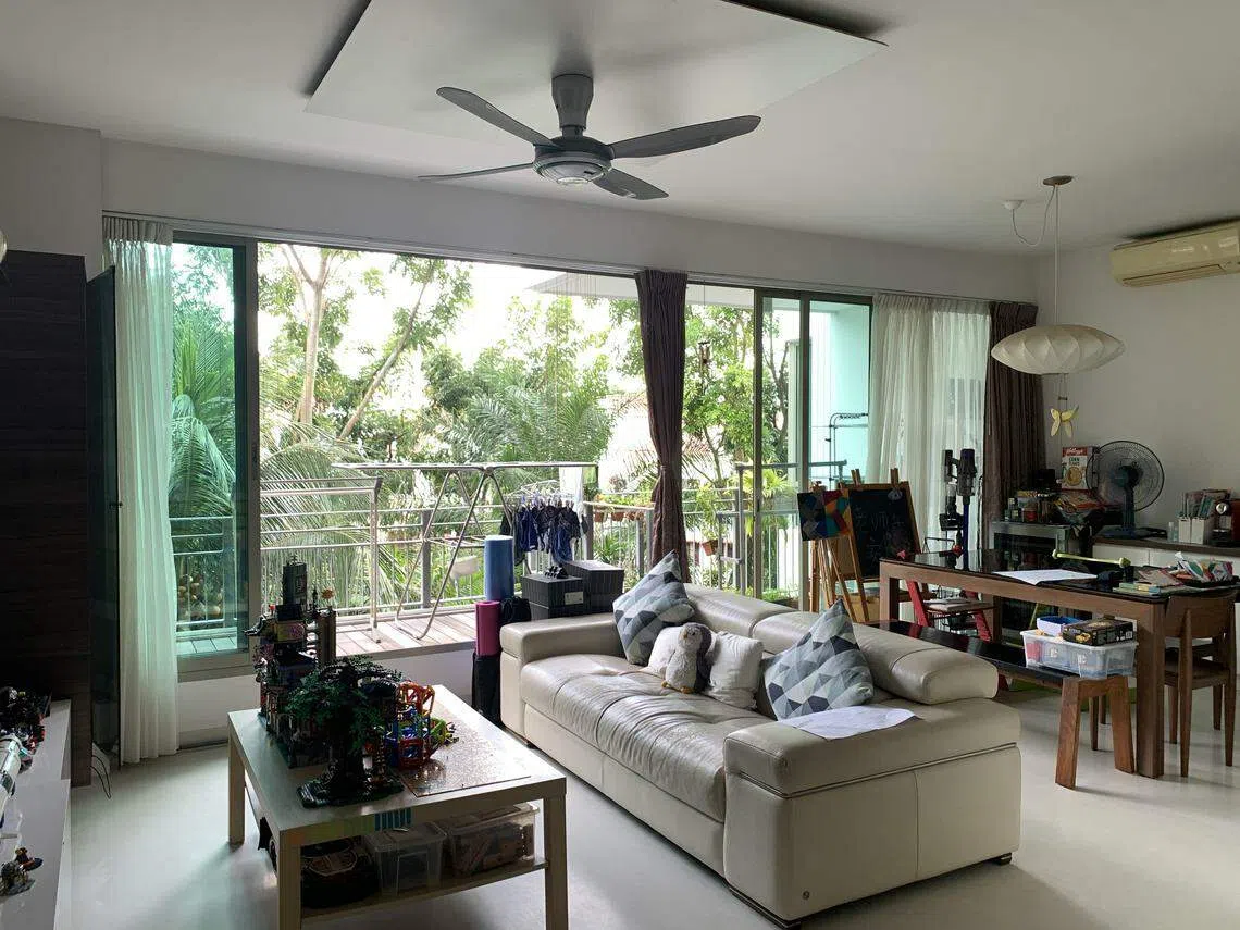
What struck him about the unit in its original form were the undefined spaces. Since there was insufficient storage space, there was a lot of clutter and random pieces of shelving units placed in areas meant for circulation.
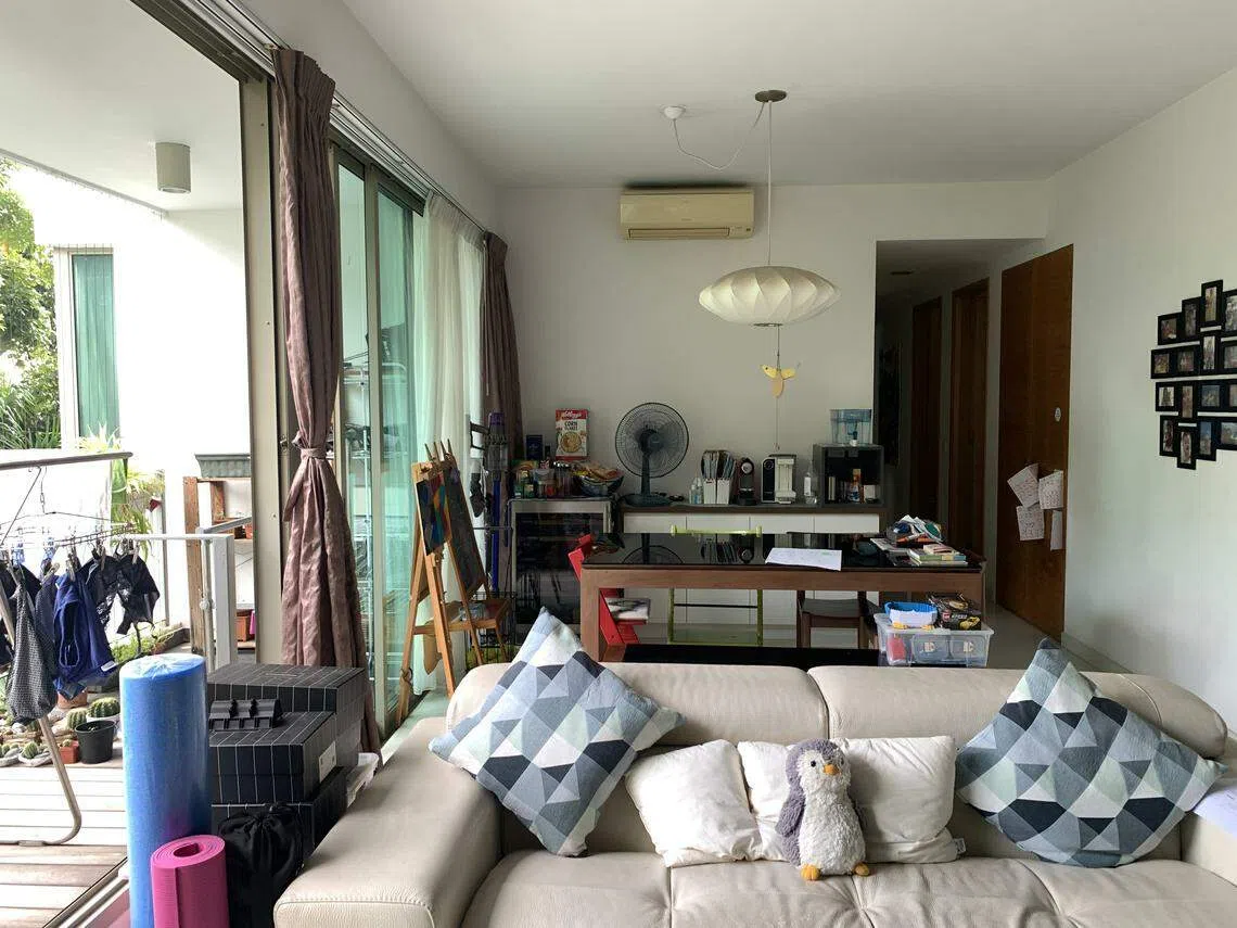
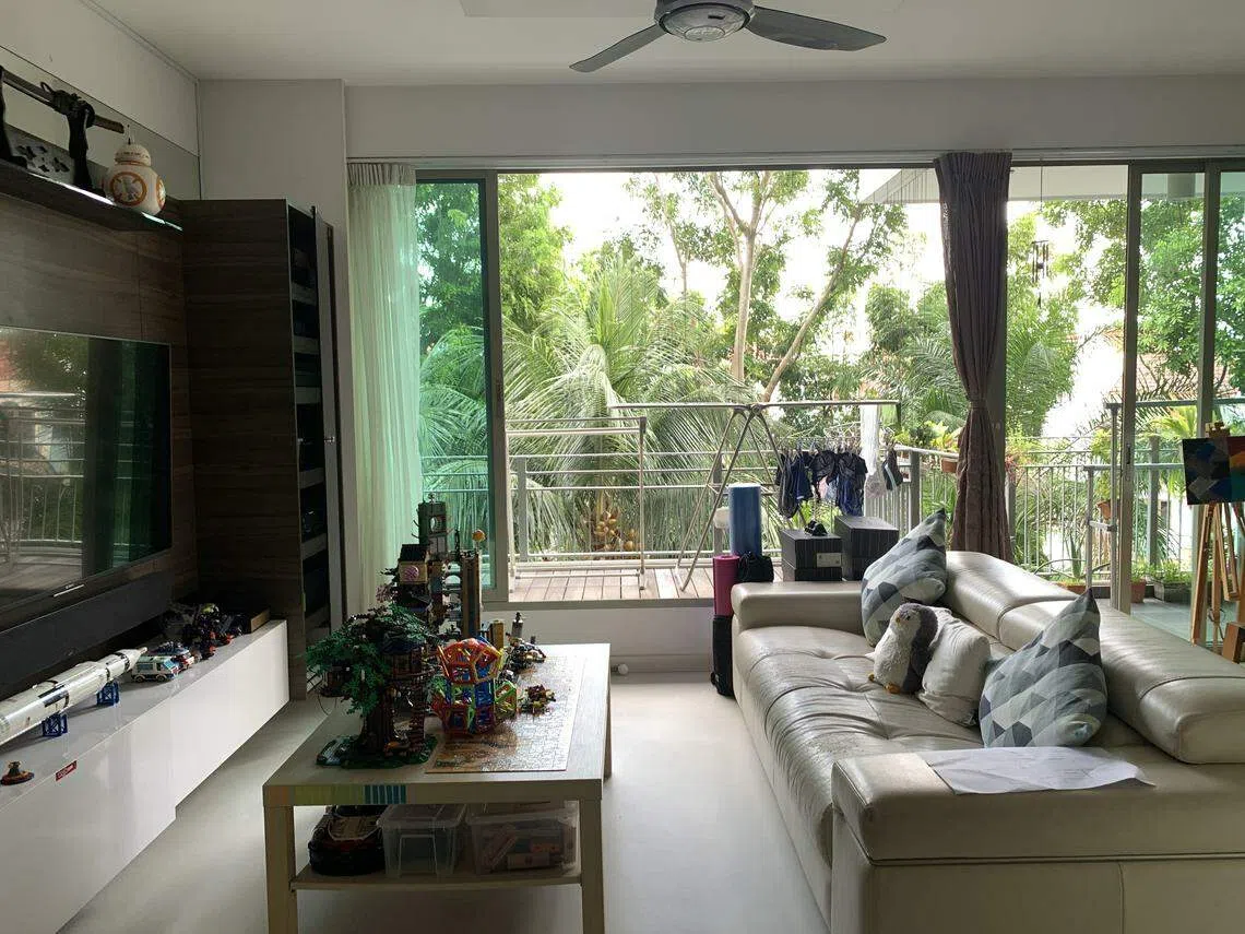
Planter boxes next to the living room were covered over with a wooden deck, on top of which sat racks of laundry hung out to dry.
“There were a lot of spaces that were underutilised,” adds Teoh. These included bay windows, which were all the rage with developers years ago.
SEE ALSO

In redrawing the layout, he wanted to ensure that circulation was good and areas had the flexibility to serve more than one use. That involved some thinking out of the box.
Of walls and wasted spaces
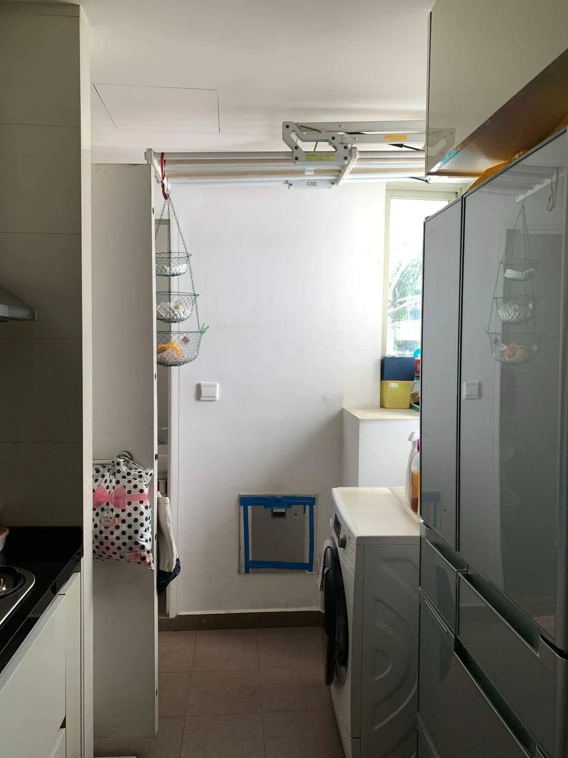
The first action he took was to demolish the kitchen wall that formed part of the entrance corridor into the apartment, as it made the space narrow and dark. Despite the Ngs wanting a bigger kitchen, he convinced them that it made more sense to push the wall in and create two kitchens instead.
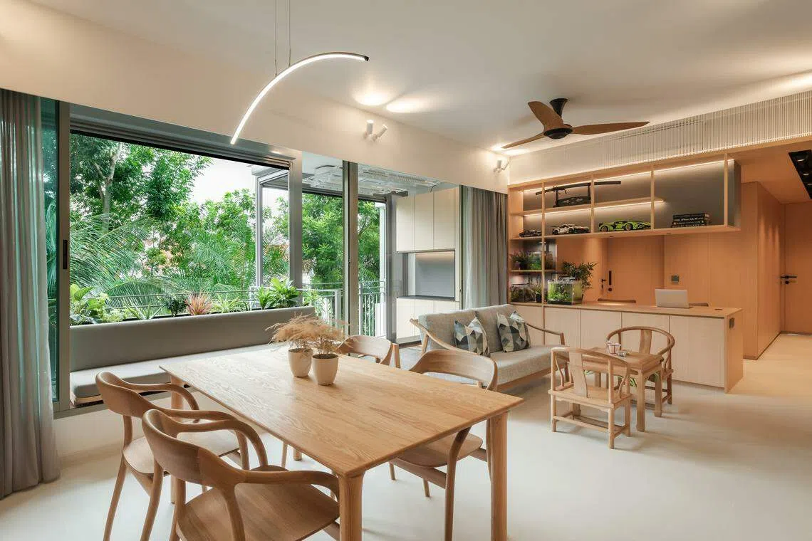
Today, an elegant dry kitchen greets guests in a new foyer that was made possible from the removal of the wall. On its left is a neat row of floor-to-ceiling cupboards, and on its right, the now-smaller wet kitchen – reorganised with additional cabinets installed – concealed behind a sliding vertical slat door.
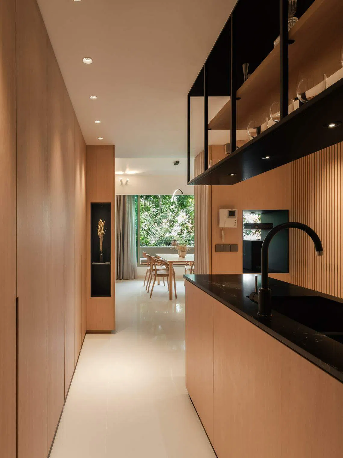
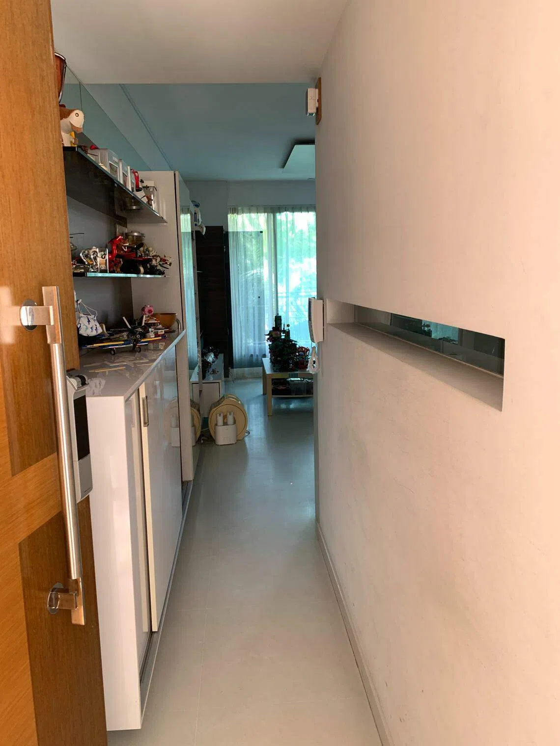
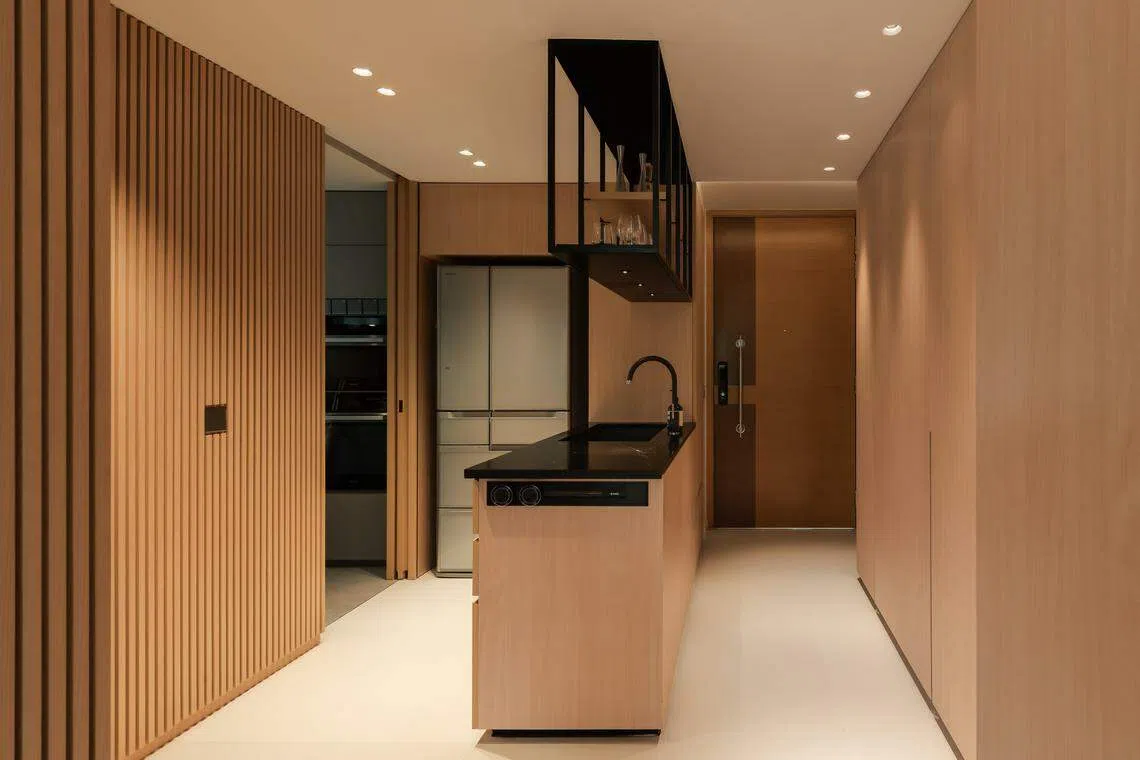
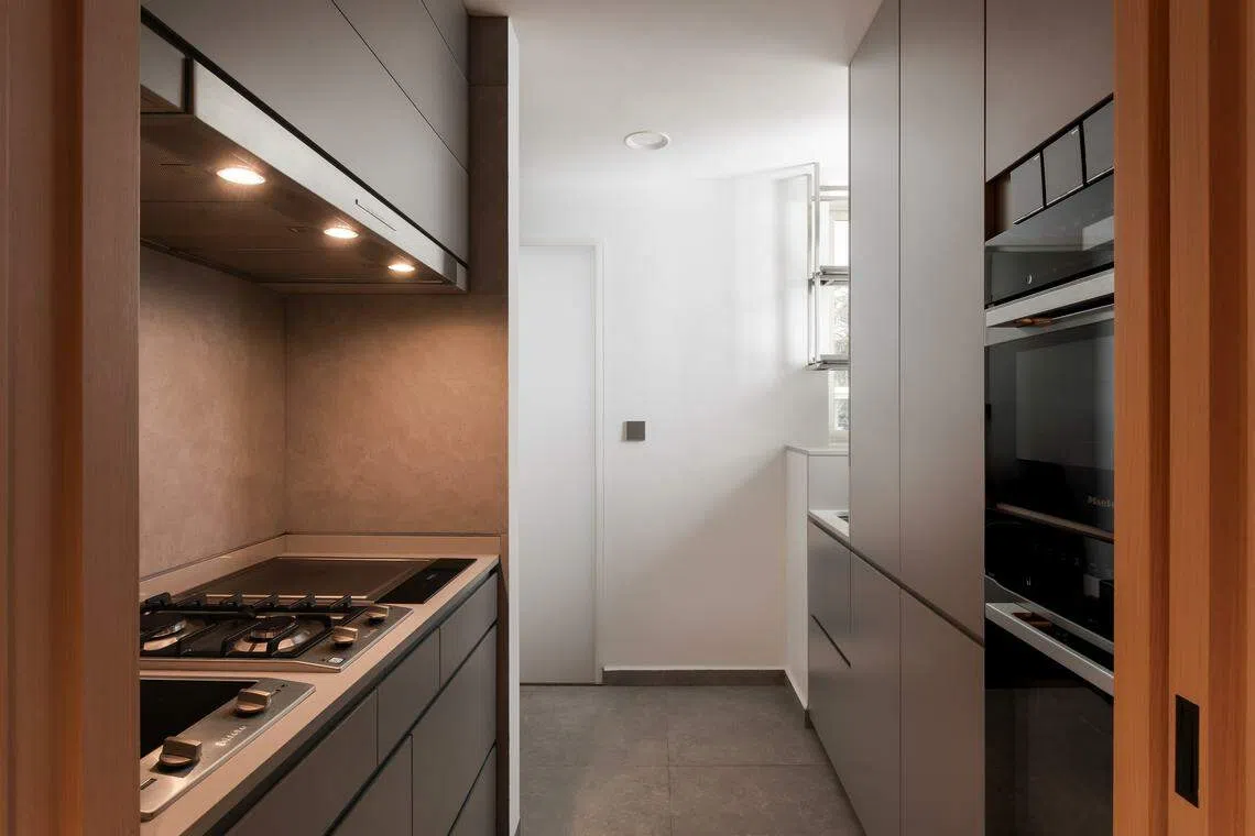
This not only opened up the entryway, it also focused attention on the view of the lush greenery right outside the fourth-floor apartment. “When you enter the home, it’s no longer awkward and narrow, both physically and visually,” says Teoh. “It also feels a bit more relaxed.”
Next, he swopped the location of the living and dining areas, so the dining table is nearer the kitchen, which made a lot more sense. Because of the table’s new position next to the planter boxes, Teoh also removed the decking and “borrowed” some of the planter box space to create a moveable banquette seating.
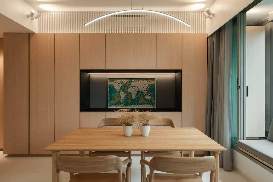
“Now, you can fit more people into this nice little dining area,” he notes, adding that greenery was brought back into the home with a new, narrower planter box.
Meanwhile, to make better use of space while enhancing circulation, the television now hangs on a wall along the passageway that leads to the bedrooms. This way, the walkway also serves as part of the living area.
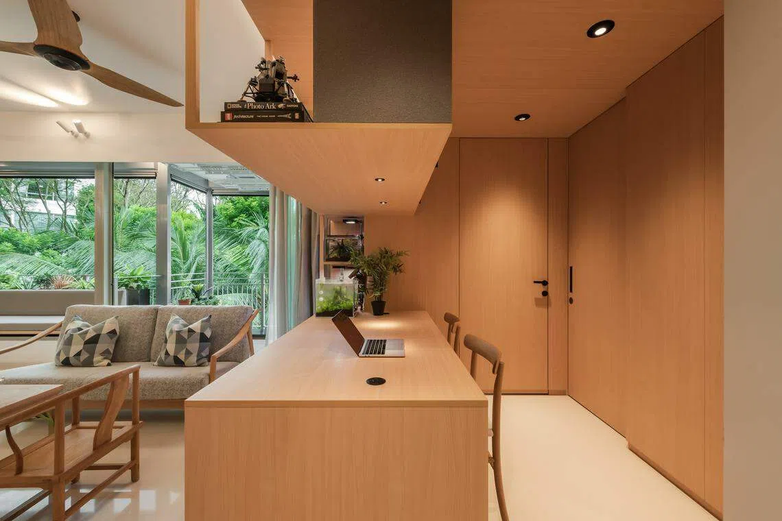
“We also concealed the doors to the toilets and rooms to make the look more seamless,” says Teoh of the wood panelling feature that runs across the length of the home.
In addition, some “wasted spaces” were carved out for better use. For instance, the narrow entryway to the study was done away with to construct a second study area – which doubles as a dining counter – next to the living room. Similarly, a doorway into a common bathroom was closed off to create additional storage, and its entrance relocated.
A question of utilisation
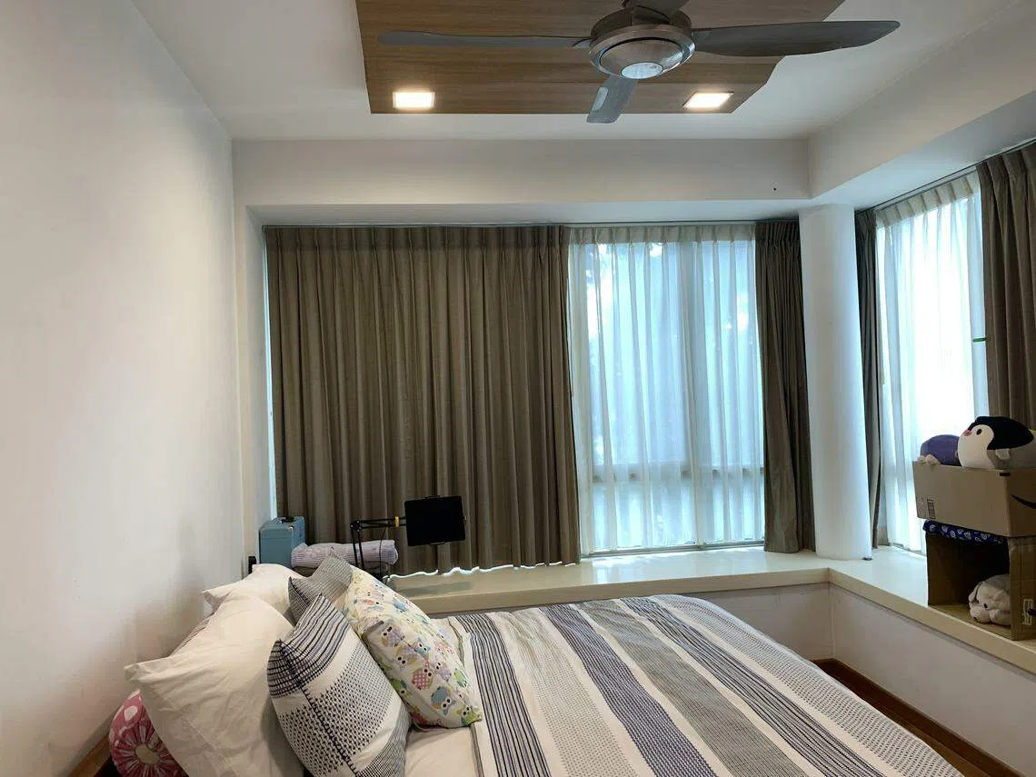
Next, Teoh solved the problem of underutilised bay windows by building a platform bed over them in the master bedroom. The platform makes the room visually bigger, and also provides additional storage underneath.
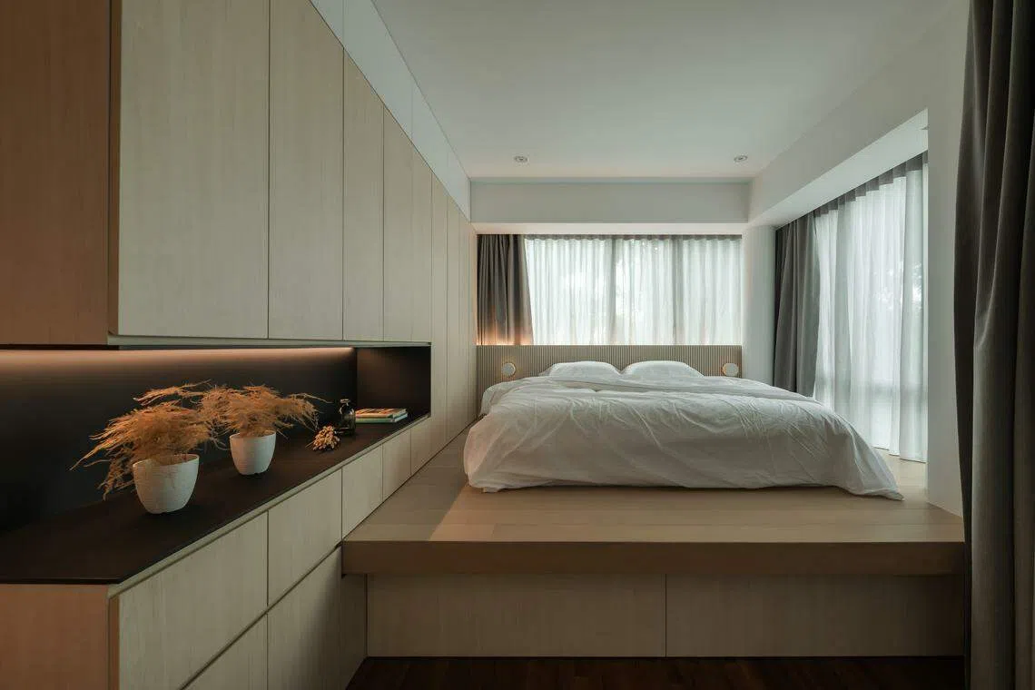
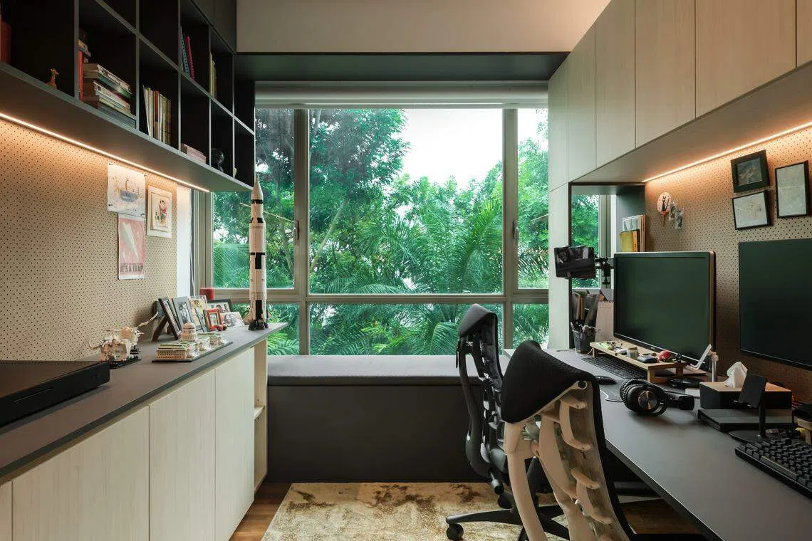
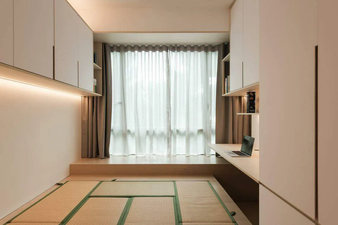
Likewise, one of the other two bedrooms now features a tatami platform bed. Cupboards and a study desk were built along one wall, while more cabinets and a whiteboard now stretch across the other wall.
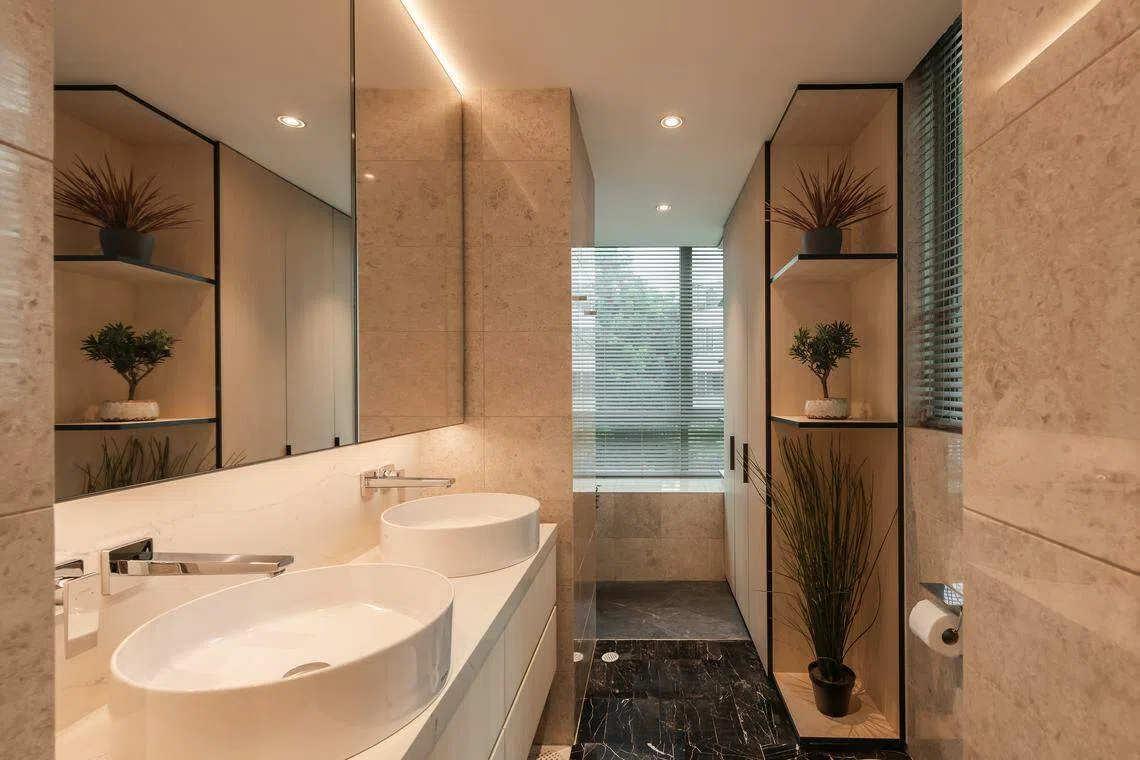
In the master bathroom, the underused bathtub was removed, so a good-sized shower area could be created, and shelving built.
Even though the main aim was always to create as much storage space as possible, Teoh was also focused on making them look less like, well, storage.
“Rather than just building only closed cabinets, we created some recessed spaces to frame, say, the dining area,” says Teoh. “This ‘wastes’ some room, but we have to balance practicality with aesthetics, so the interior doesn’t just feel like a wall of doors.”
Indeed, the overhaul has totally transformed the apartment, which the Ngs completed with furniture from Japan. Instead of a chaotic and transient vibe, they now have a calm, orderly home with spaces that make sense, and in which they can probably live comfortably for another decade.
“It’s great,” says Mrs Ng. “It’s exactly the way we wanted it to be.”
Decoding Asia newsletter: your guide to navigating Asia in a new global order. Sign up here to get Decoding Asia newsletter. Delivered to your inbox. Free.
Copyright SPH Media. All rights reserved.
TRENDING NOW
DBS remains analysts’ pick ahead of Q3 earnings after Singapore banks’ share slump

Singapore identifies 7 firms responsible for haze fires, notices issued urging action: Grace Fu
Good Class Bungalow market activity picks up pace on ‘realistic’ pricing
High Court rules against Julius Baer’s Singapore trust arm in US$50 million family trust dispute

